Castor
Participant Hub
The Participant Hub was an ambitious initiative by Castor aimed at consolidating all participant-facing features of a clinical trial into a single, seamless experience. This included filling in and submitting study questionnaires (ePRO – Electronic Patient Reported Outcomes), providing digital consent (eConsent), viewing the study schedule, joining Televisits, among others.
The primary goal was to design and build a Progressive Web Application (PWA) that would enable study participants to enter data and interact with the study environment from any device or platform. Later in this project this shifted to having both a web application and a native mobile application. The end user was someone actively participating in a clinical trial - often a vulnerable, non-technical population - so accessibility, ease of use, and clarity were central to the design.
My role
As the UX designer leading this initiative, I was involved from the very start of the project. I collaborated closely with the Product Manager and Product Owner to define the MVP and followed a Lean UX approach, balancing speed, iteration, and continuous feedback.
Approach
We began by identifying the core MVP functionality, which included ePRO and scheduling features. With a focus on getting the project started, I created initial wireframes while engineers began building out basic functionality. We accepted that early technical implementation might shift as the designs matured through testing and iteration.
Key aspects of the process included:
Rapid prototyping and internal validation with stakeholders
Regular feedback sessions with Castor employees acting as test users
Continuous design iterations based on usability insights
Prioritization of platform-agnostic patterns, in line with the PWA vision
As the project matured, the team transitioned from a waterfall-like parallel workflow to a more agile, scrum-based process, which allowed me to collaborate more closely with front-end developers and contribute to faster, more cohesive iterations.
We also explored how the Participant Hub should connect to Castor’s broader Clinical Data Management System (CDMS), extending functionality for clinicians. One specific concept involved a visual schedule based on the study protocol, a familiar and intuitive pattern for medical professionals, supporting better planning and oversight of participant engagement.
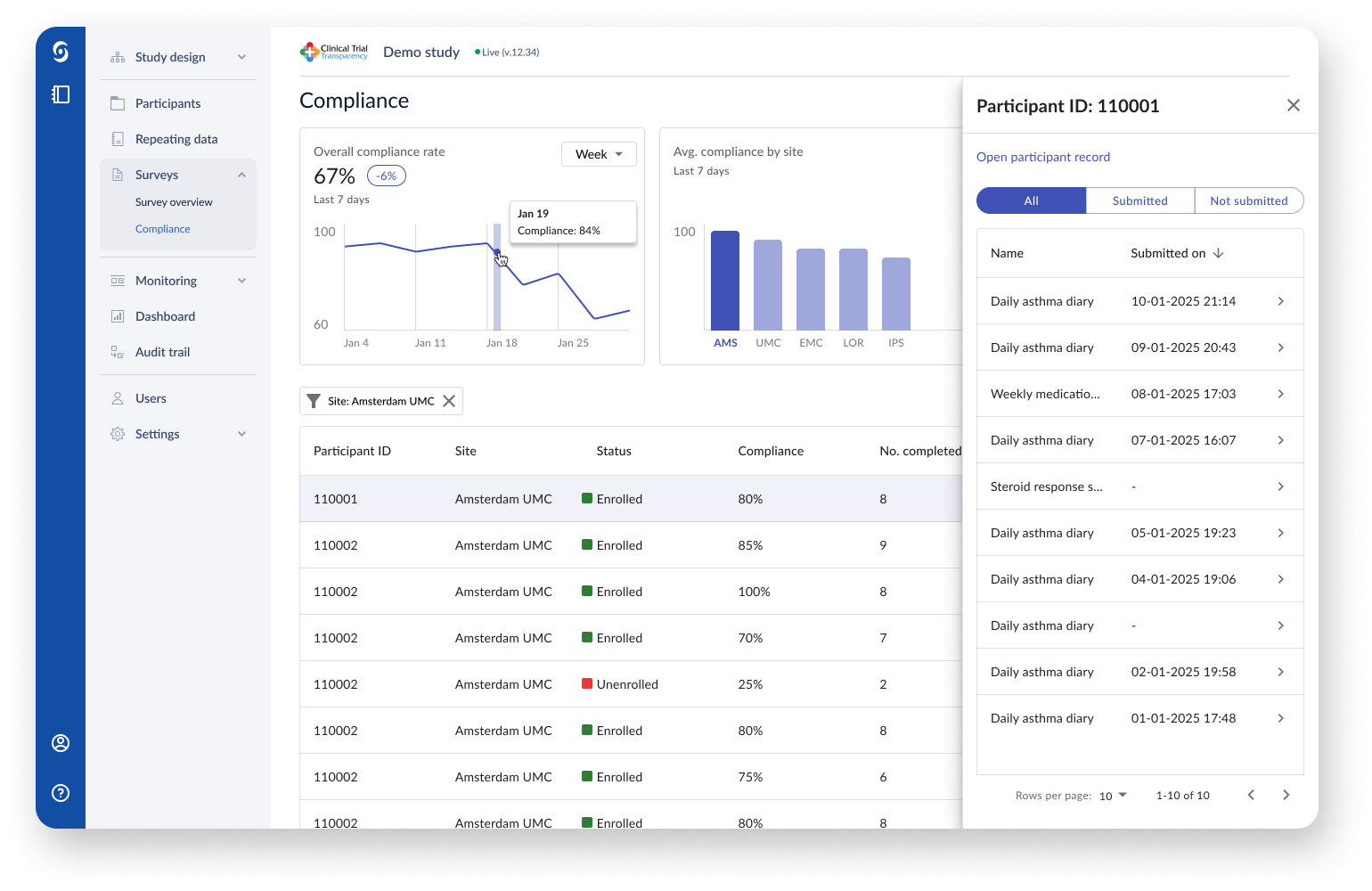
The new underlying data framework for the Participant Hub allowed for a new study investigator dashboard. Through the use of filters, the investigator can quickly check survey compliance per site and over specific periods of time.
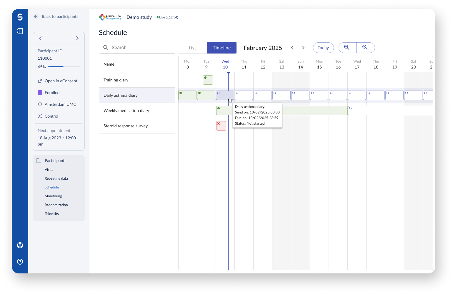
Through visualising the study schedule in a timeline, study investigators have an easier overview of repeating questionnaires and other events during the course of a clinical trial.
Challenges
Despite the well-defined UX process, several constraints influenced our workflow:
Limited access to actual end users due to privacy policies. Instead, we tested concepts with internal employees who completed mock study tasks and questionnaires.
Designing a true PWA presented its own challenges—balancing screen space, interaction consistency across platforms, and installability, all while maintaining simplicity for users unfamiliar with digital tools.
Correct implementation of clinical instruments (e.g., standardized questionnaires) was crucial. Some institutions enforced strict usage guidelines, requiring repeated validation cycles and extensive discussions with external representatives to ensure compliance.
Some clinical instruments demanded no scrolling of the page, allowing the user to see all options on a checkbox or radiobutton field question to prevent bias. By stress testing the design on small screen sizes and using German translations, the design was optimised for compliance.
Impact
Although the Participant Hub had not launched publicly before I left the company, it was already receiving positive internal feedback. Castor employees appreciated its usability, clear interface, and consistency. The underlying infrastructure also opened up new opportunities for clinician-facing functionality, a promising direction for future development.
Reflection
This project offered valuable lessons:
I had the opportunity to build a product from the ground up, shaping its structure, flow, and visual language.
I learned how to adapt to different development models, starting with a waterfall approach and later transitioning to a more agile process, which enhanced collaboration and responsiveness.
Working within technical, regulatory, and privacy constraints helped me strengthen my problem-solving and stakeholder communication skills.
I deepened my understanding of designing for both patient-facing and clinician-facing needs, ensuring clarity, accessibility, and regulatory compliance without compromising user experience.
This was the first project for me where I designed for both light and dark mode. This allowed me to study different colors and their contrast, and how to apply them in a way that would communicate a clear hierarchy of page elements.
Let’s connect!
Send me a message or connect on LinkedIn if you want to get in touch.